AdTeam — AI platform for marketing teams.
Services: UI/UX, Web App
Categories: SAAS
While creating AdTeam, our team—together with our client Louis—drew inspiration from the iconic era of American advertising in the 1950s and ’60s. It was a true golden age for the industry—a time when legends were born and ads became a form of art.
We immersed ourselves in the visual culture of this “golden age,” full of bold ideas and charismatic characters. It was during this time that some of the most legendary ad campaigns emerged, such as:
• “Think Small” by Volkswagen — revolutionary in its honesty and simplicity;
• The Marlboro Man campaigns — a symbol of rugged masculinity and the idealized cowboy;
• “I’d Like to Buy the World a Coke” by Coca-Cola — one of the most iconic commercials, connecting global culture through a message of unity and positivity.
Our goal wasn’t just to replicate the style of that era, but to capture its spirit—the spirit of creative freedom, candor, and charisma that still inspires brands around the world. That’s why AdTeam isn’t just a nod to retro aesthetics, but a modern reinterpretation of the classics, crafted with love for the details.


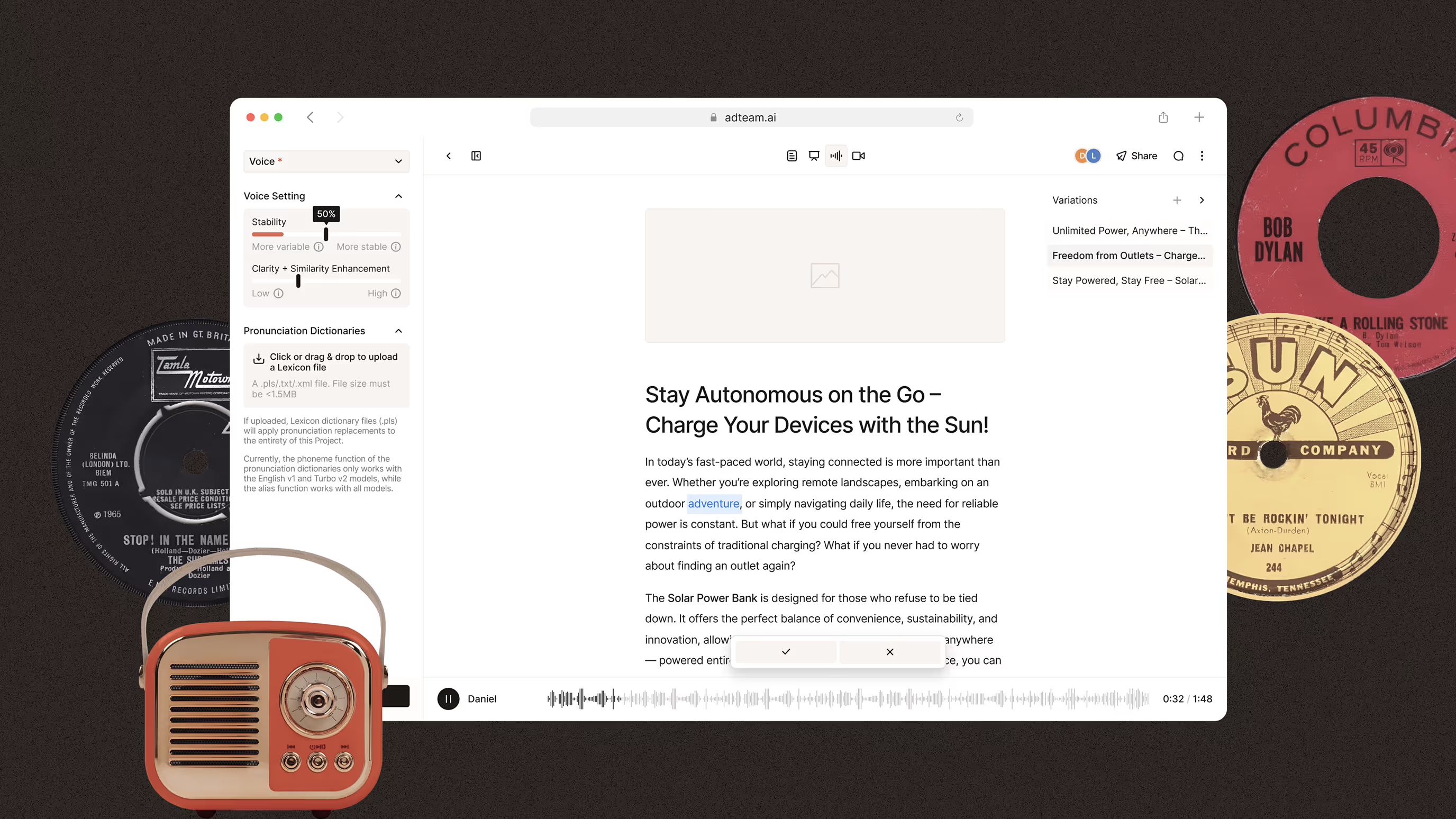
At the heart of AdTeam lies its document editor interface — the place where all the advertising “magic” happens. But this isn’t just a basic text editor — it’s a flexible AI generator that works based on a predefined Buyer Persona profile and a detailed product description, including its key attributes.
The ability to finely tune both the product and the target audience is a critical part of the system. These two elements — the product description and a deep persona profile — serve as the foundation for generating accurate, contextually relevant messaging. They shape the AI editor’s “thinking”: what we say, to whom, in what tone, and in what format.
To support more flexible text creation, the editor also includes integrated Ad Generators — AI-driven templates that adapt messaging for different ad types, platforms, and campaign goals.
The document editor is more than just text — it serves as the foundation for generating audio and video ad content, unlocking the ability to launch multi-format campaigns from a single starting point. As we like to joke: “AdTeam is like Notion for ads — but with a brain.”
With just one click, you can switch from a text document to an audio or video format — and your interface instantly adapts to the new mode of work. Using the ad copy you’ve already created, you can fine-tune generation parameters, and watch your words come to life — as voice or motion. It’s like seeing your idea jump from static text to dynamic media — in just a matter of minutes.
We get it — going through every single screen of the AdTeam interface isn’t exactly a quick scroll. The scale of the project is truly massive — even our Figma pages have been begging for mercy. So instead of walking you through it screen by screen, we’ve prepared a more strategic overview — a block diagram that lays out the global architecture of AdTeam.
It’s a focused snapshot of the product’s core modules, designed to help you understand how the system is structured, how the features interact, and where the real magic of ad generation happens. At IXD’s Büro, we’ve carefully considered every detail of this architecture — from the logic behind module interaction to the smallest UX decisions — to make AdTeam a truly powerful, cohesive, and scalable tool.
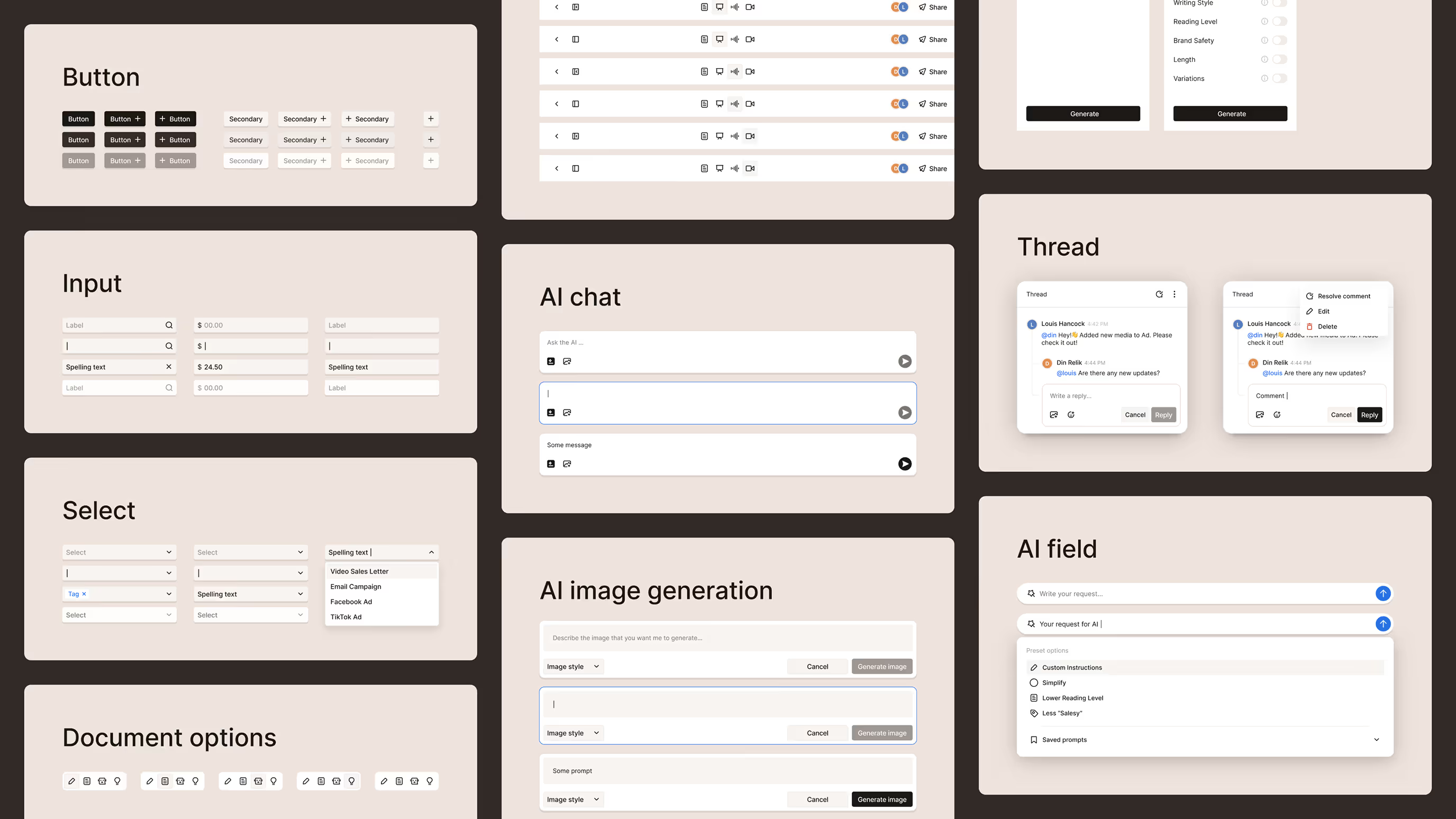
As with any digital product, we developed a complete design system for AdTeam — featuring a unique visual style, a custom icon set, and flexible UI components. This system not only ensures visual consistency across the interface but also enables efficient product scaling, smooth feature implementation, and long-term stability.
This approach guarantees that any future expansion or redesign will be not only predictable but also seamlessly integrated — without compromising on quality or stylistic coherence.
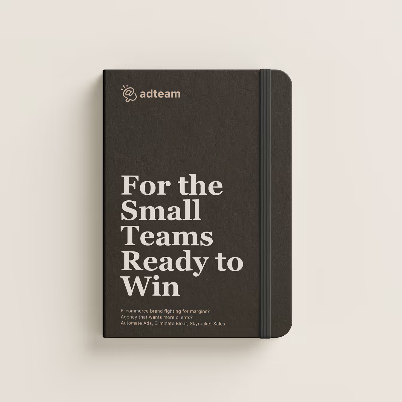
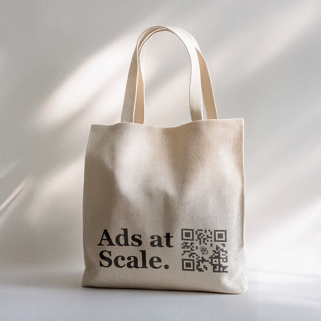
The AdTeam brand identity is unified, minimalist, and instantly recognizable — both in digital environments and physical spaces. It’s minimalism with intention. Short text, maximum meaning — words are all you need for a powerful ad message.
In a world full of noise and visual overload, the best way to be heard is to strip away the unnecessary. Clean design, clear messaging, the right emphasis. What truly works — no extra images required.
The AdTeam brand identity is cohesive, concise, and instantly recognizable — both in digital spaces and the physical world. It’s minimalism with meaning. Short copy, maximum impact — because sometimes, words are all you need for a powerful ad message.
In a world overwhelmed by noise and visual clutter, the best way to stand out is to strip away the excess. Clean design, clear messaging, precise emphasis. What truly works — no unnecessary visuals.
Design: Din Relik
Management: Eugene Lipski
Client: Louis Hancock — Founder of AdTeam
