Farria — Premium Chicken for Global Markets
2025
Services: Identity, Web Design, Webflow
Categories: Company website
Farria is a sub-brand of Agro Oven, an international agro industrial company with a 25-year history of specialising in the production of high-quality poultry. The brand’s products are sold in national retail chains and exported to Europe, Asia, and the Middle East.
We refreshed Farria’s visual identity by creating a new logo, updating the style to meet modern market trends, and developing a functional catalog website to showcase the brand’s product range online.
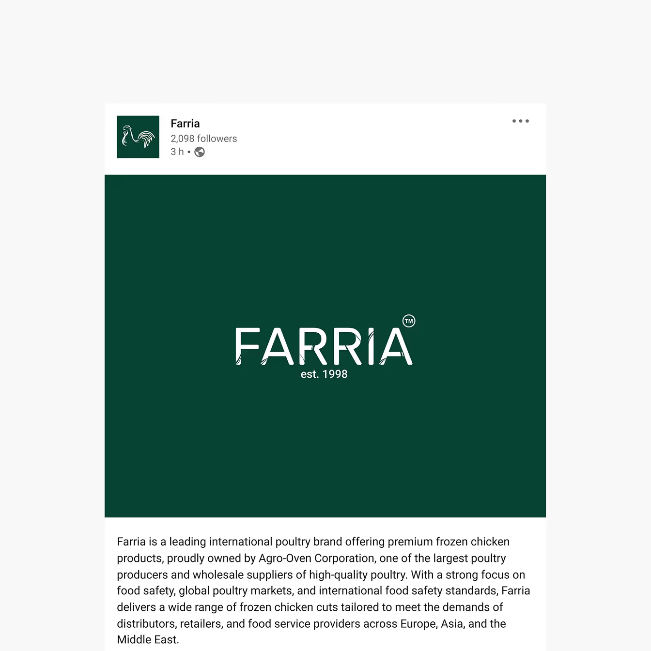
Farria’s visual identity is built around the symbol of a chicken — a simple yet instantly recognizable image for the 40+ audience. This was a key client request: the logo had to clearly convey the essence of the brand and highlight its story. That’s why we chose an engraving-style illustration for the symbol.
The logo comes in two versions: a signature icon (the chicken) for social media, and a text or full version for websites, packaging, and advertising.
The custom typeface is stylized to resemble grass and feathers, reflecting the brand’s natural and friendly mood. The color palette features warm shades of green and lime, replacing the cold dark green of the old identity. This shift made the products look more visually appetizing and appealing.

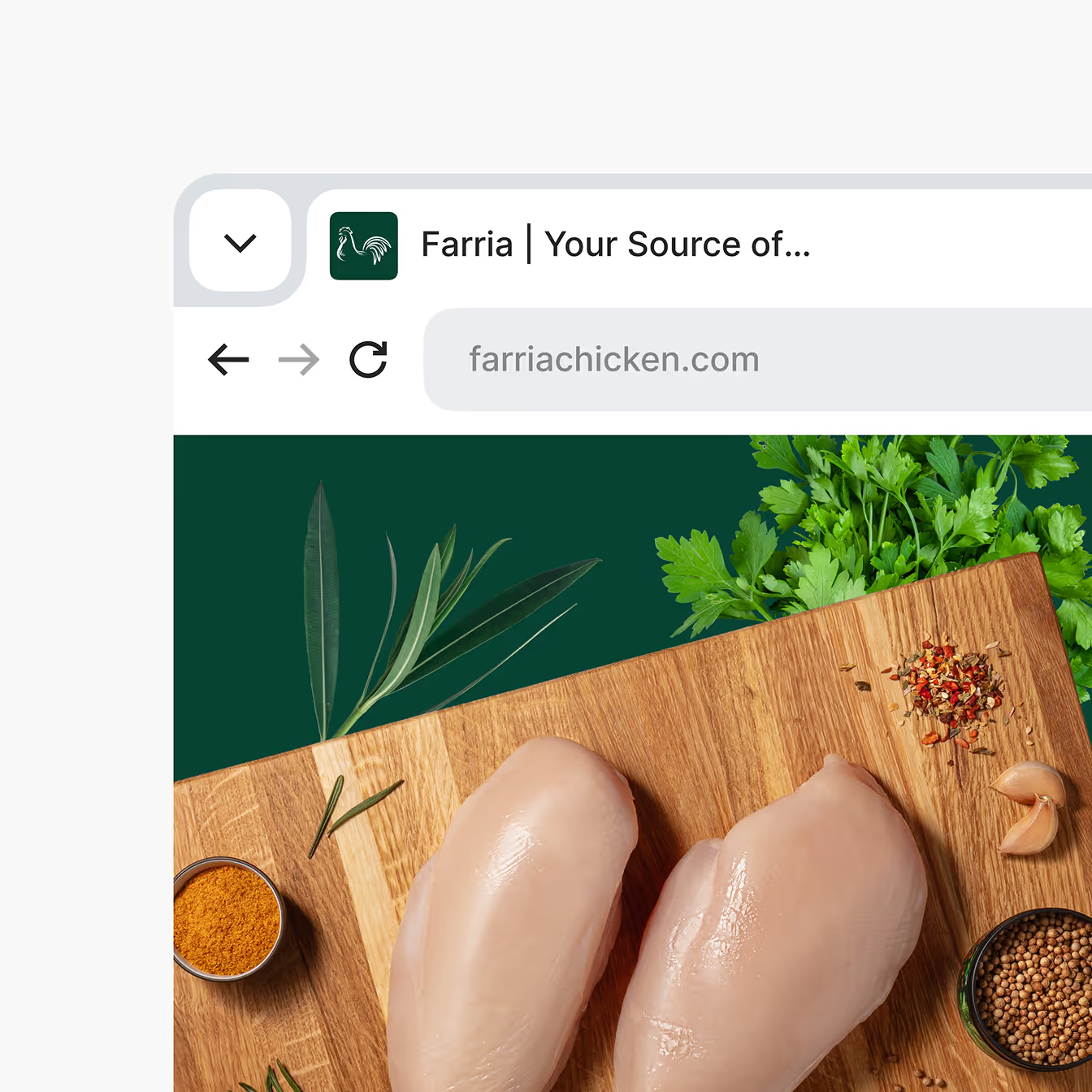
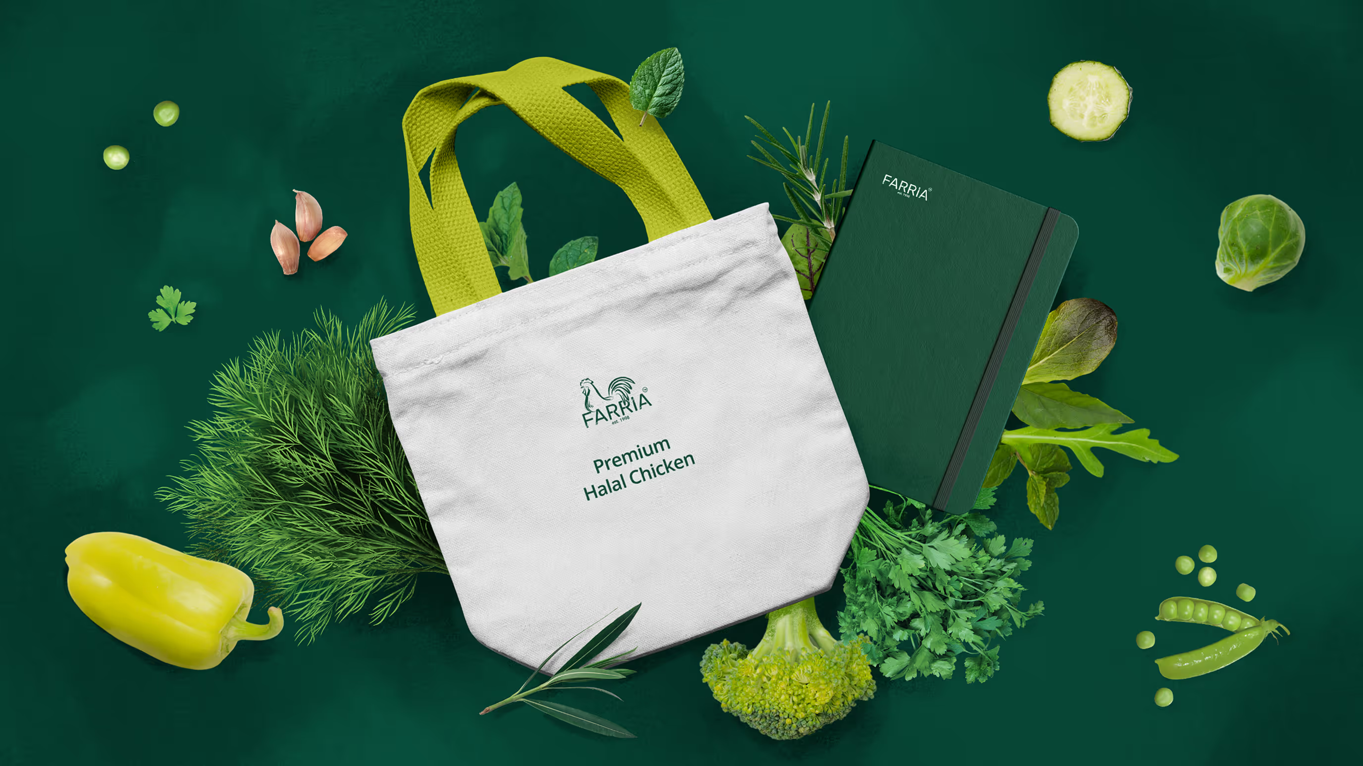
An important part of Farria’s visual identity is the use of collaged imagery. This approach was chosen due to the company’s limited resources and time for regularly updating high-quality visual content.
Collages make it possible to quickly create aesthetic product presentations in a consistent style and with a unified background. The background, featuring shades of the brand’s signature green, adds depth and appeal to the images, making them look visually cohesive and realistic.
Collages work equally well for showcasing products and creating branded materials.


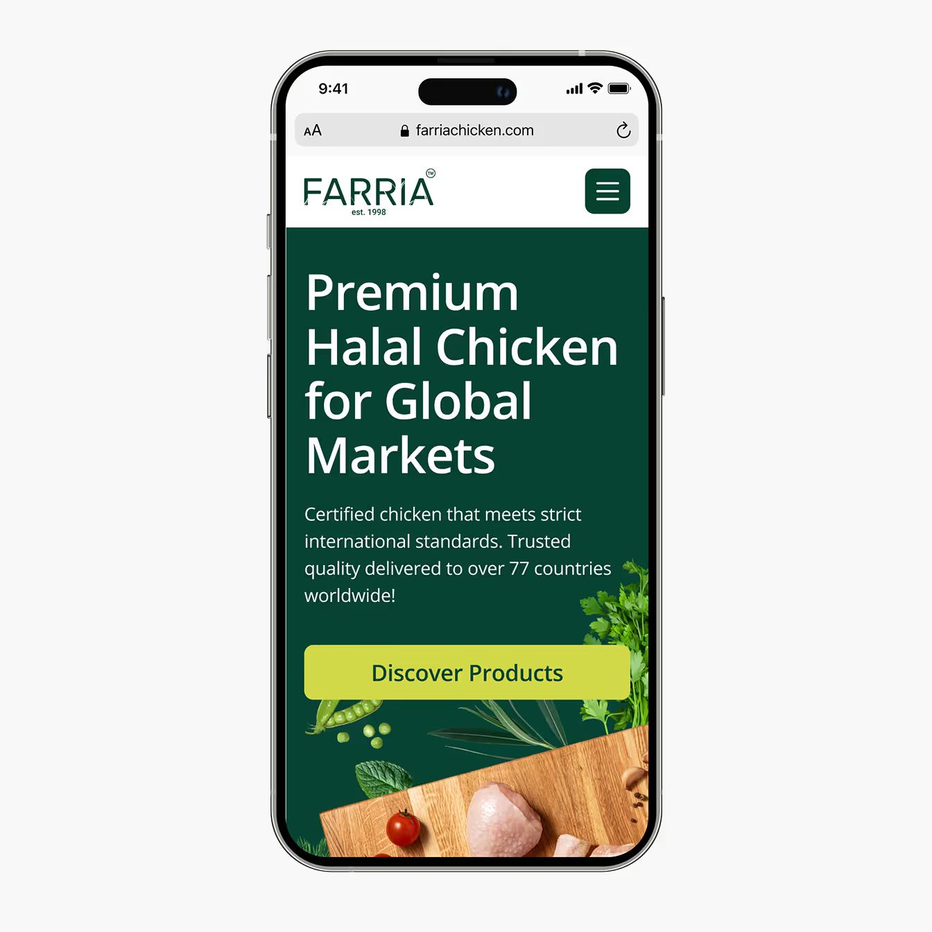
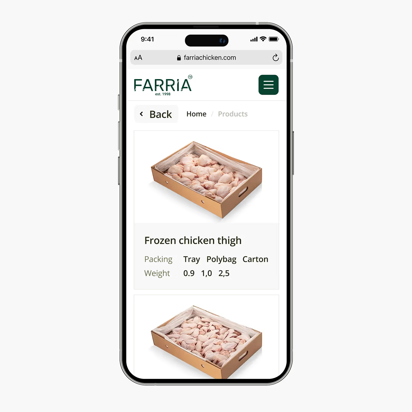
The main goal of Farria’s website is to introduce the company and showcase its product catalog. We created a simple yet visually appealing website that is clear and user-friendly for the 40+ audience.
As a B2B brand, Farria requires a restrained design that still feels approachable to the corporate segment. To keep the site from feeling too minimal or dry, we enriched it with graphics and interactive animations that respond to user actions, encouraging visitors to explore the catalog and submit inquiries.
Design: Din Relik
Animation: Stanislav Zhuravlov
Management: Eugene Lipski
Client: Bohdan Zavorotnyi — Account Manager of Farria
