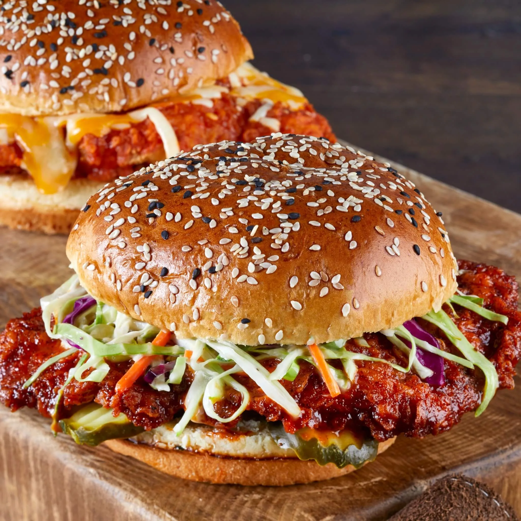
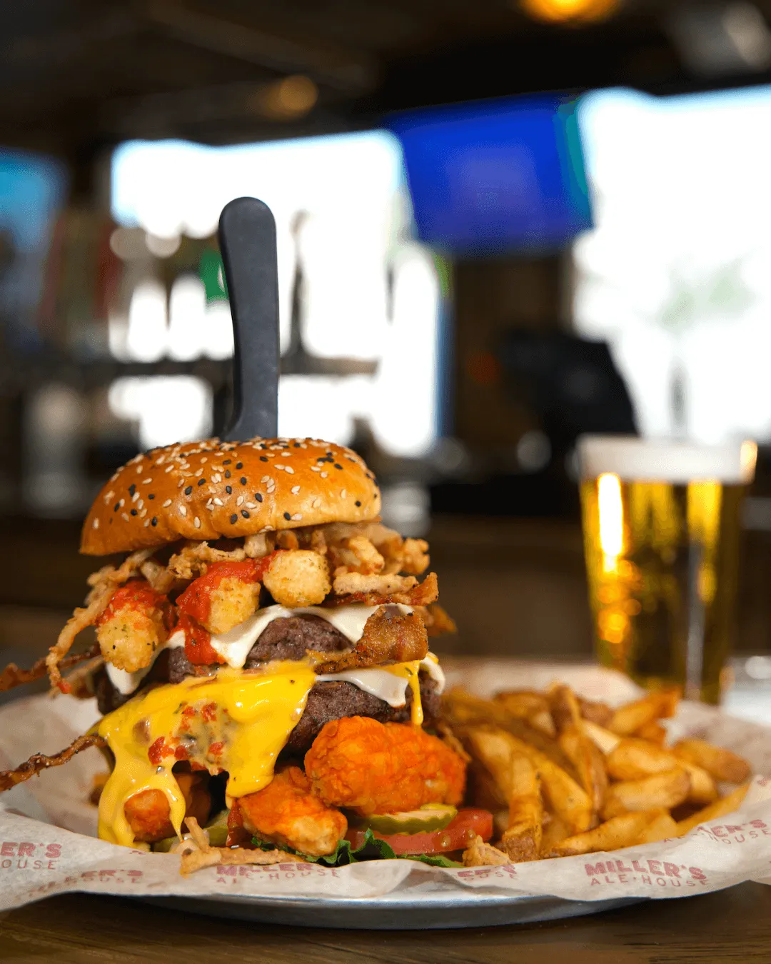
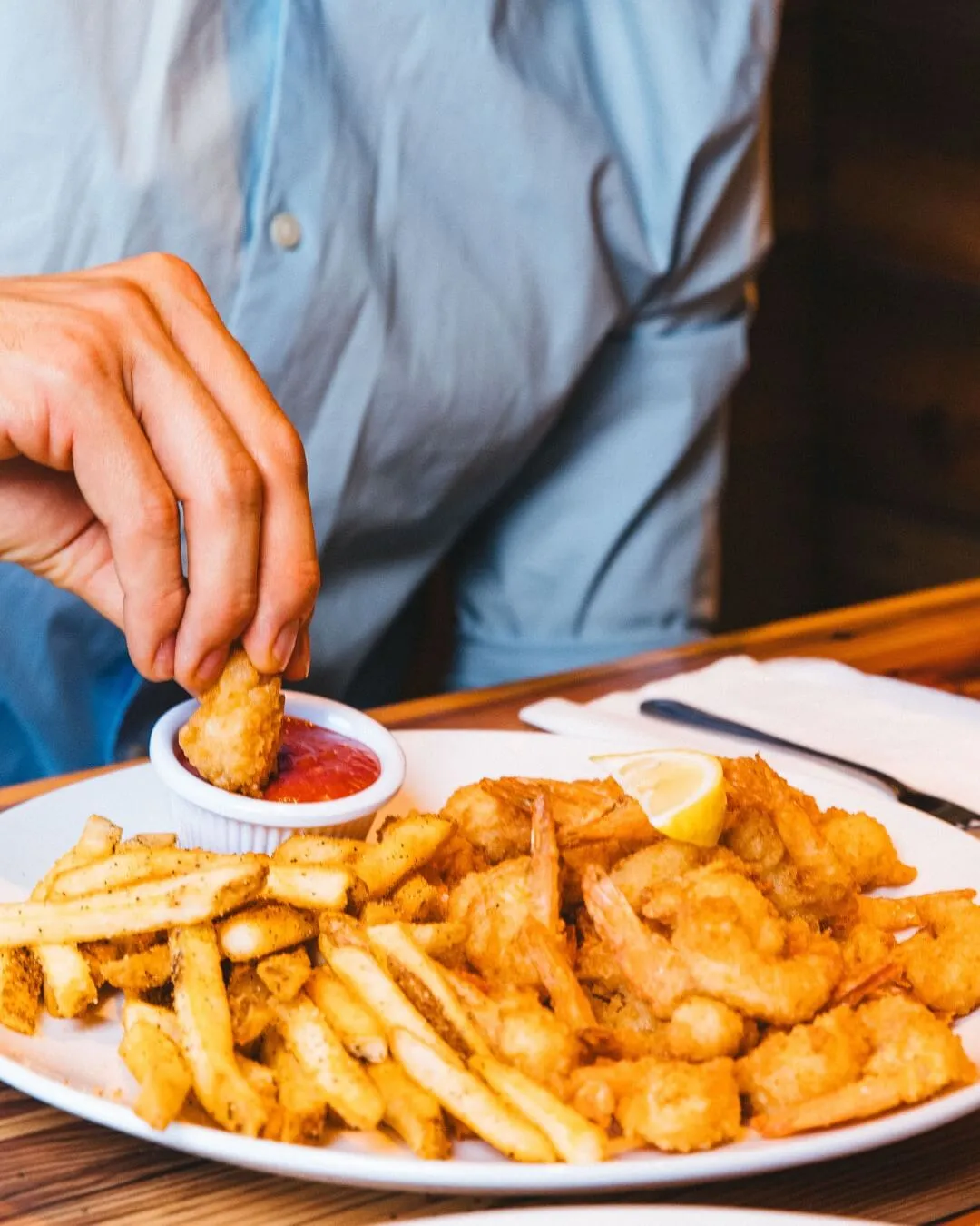
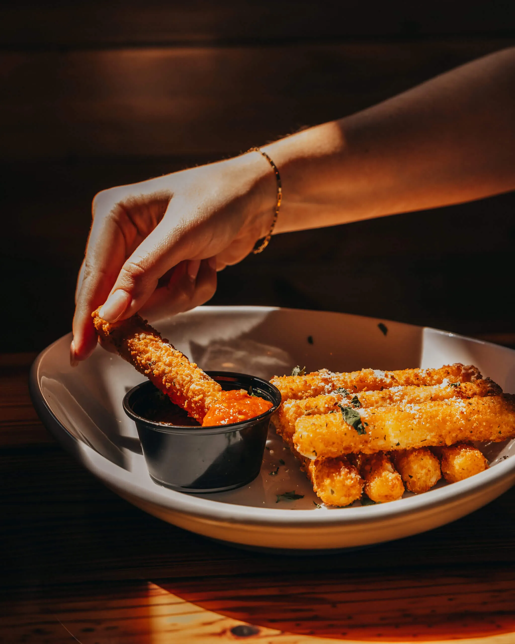
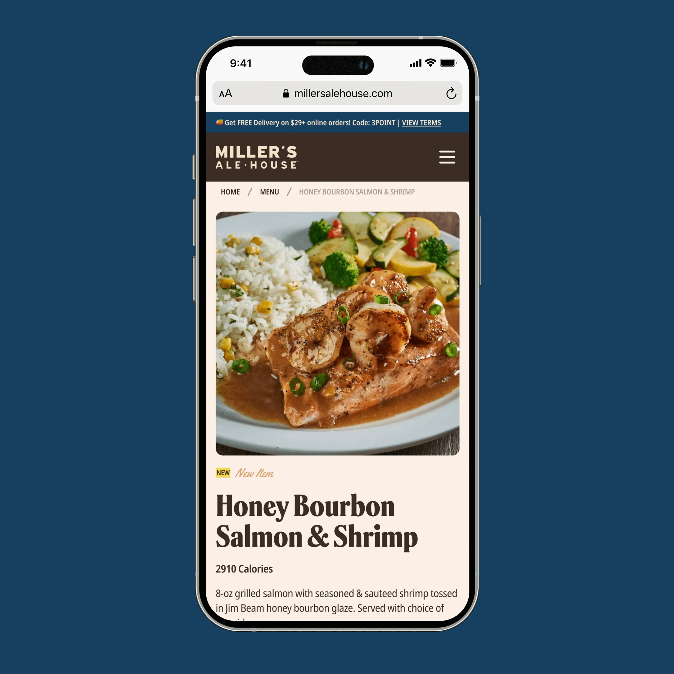
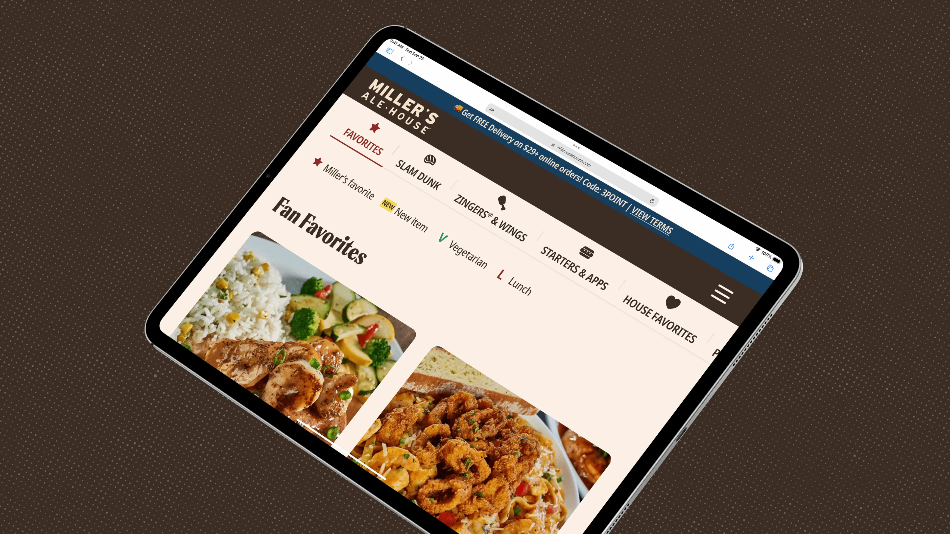
For the menu redesign, we completely changed the navigation logic. Previously, users had to first select a category before viewing the dishes. Switching between categories was inconvenient — they had to go back each time, which slowed down the selection process.
The new approach is continuous scrolling through all the dishes with clear category separation and quick anchor links: positioned on the left for desktop and fixed at the top in the mobile version. Users always see where they are and can easily switch between sections.
Before creating the new menu, we researched over 20 competitor websites, analyzed their solutions, collected the best UX practices, and took common mistakes into account to avoid them in our own solution. As a result, the menu became clear, fast, and convenient for both desktop and mobile users.
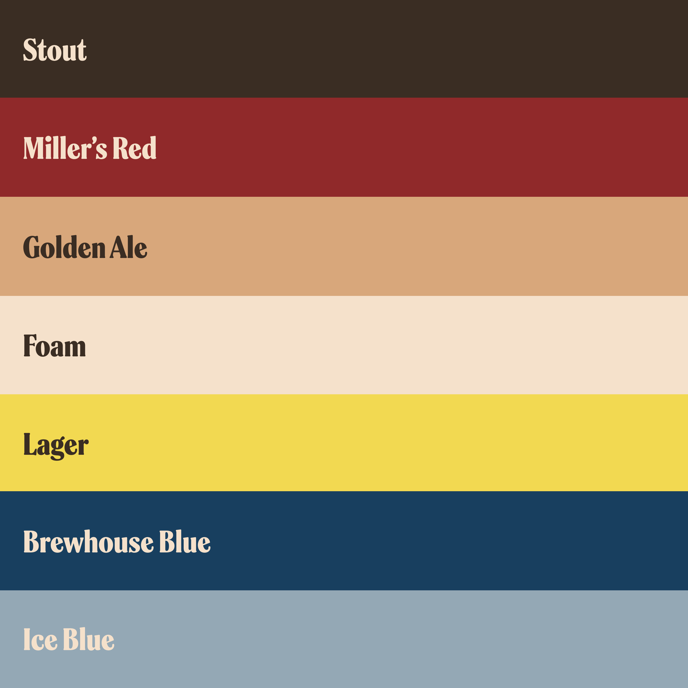
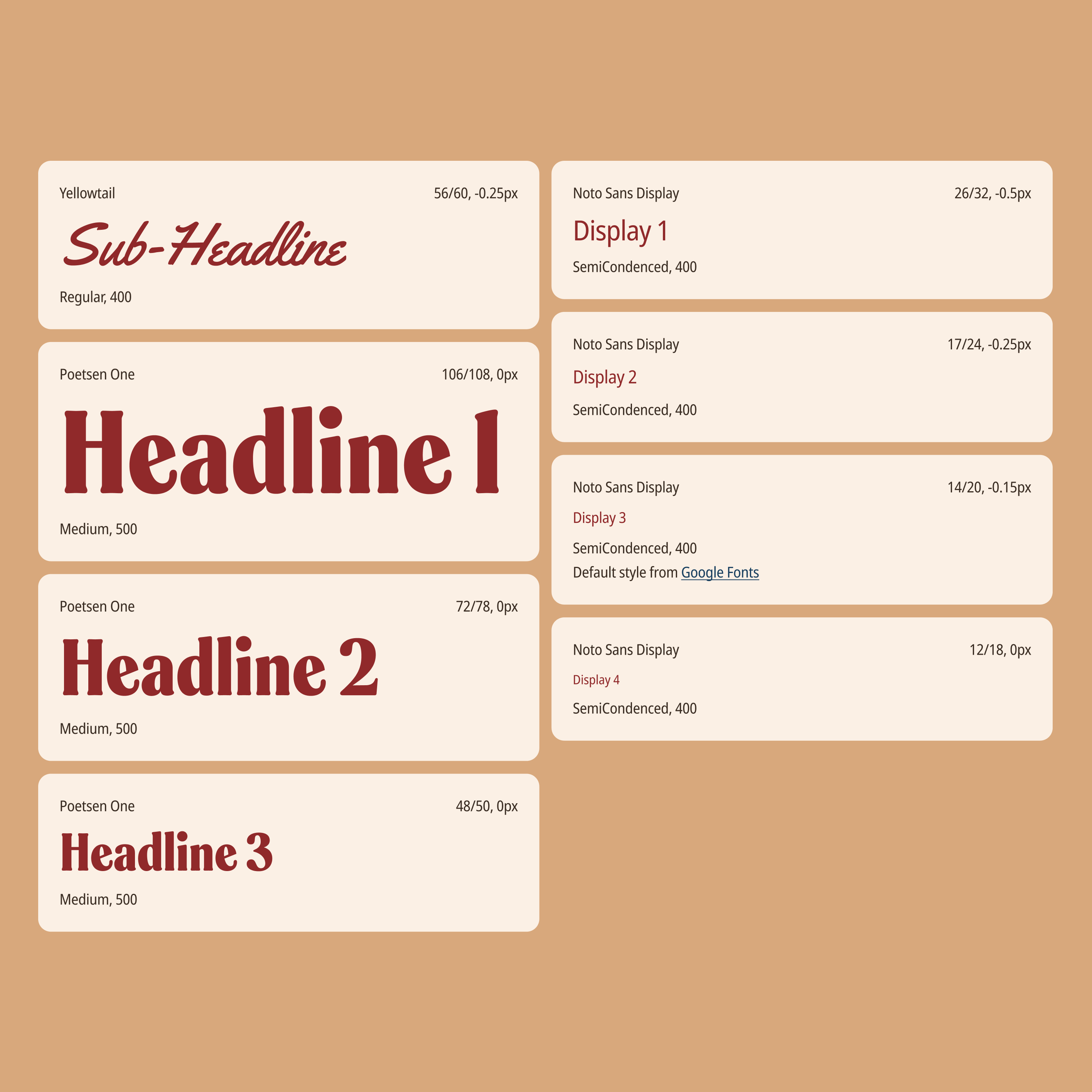
The client came to us with an existing brand book that defined the core principles of their style and identity. Our task was to adapt these guidelines to the updated website, taking into account its scale and complexity.
Based on the brand book, we developed a dedicated design system specifically for Miller’s Ale House digital products. To maintain visual consistency and coherence across all interfaces, we created a custom MAH component library. This library became the foundation for all design decisions throughout the project and helped ensure a unified style at every stage of development.
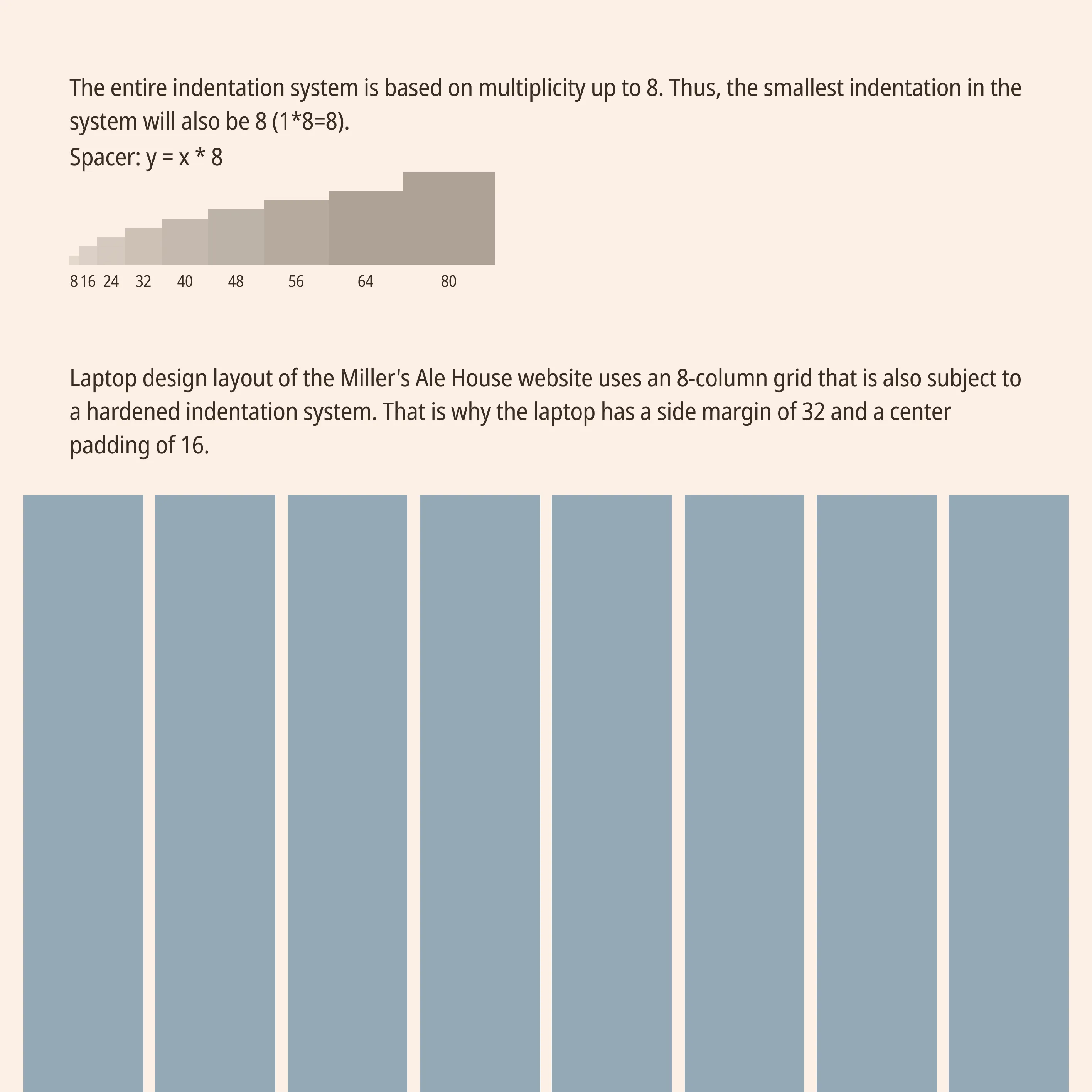
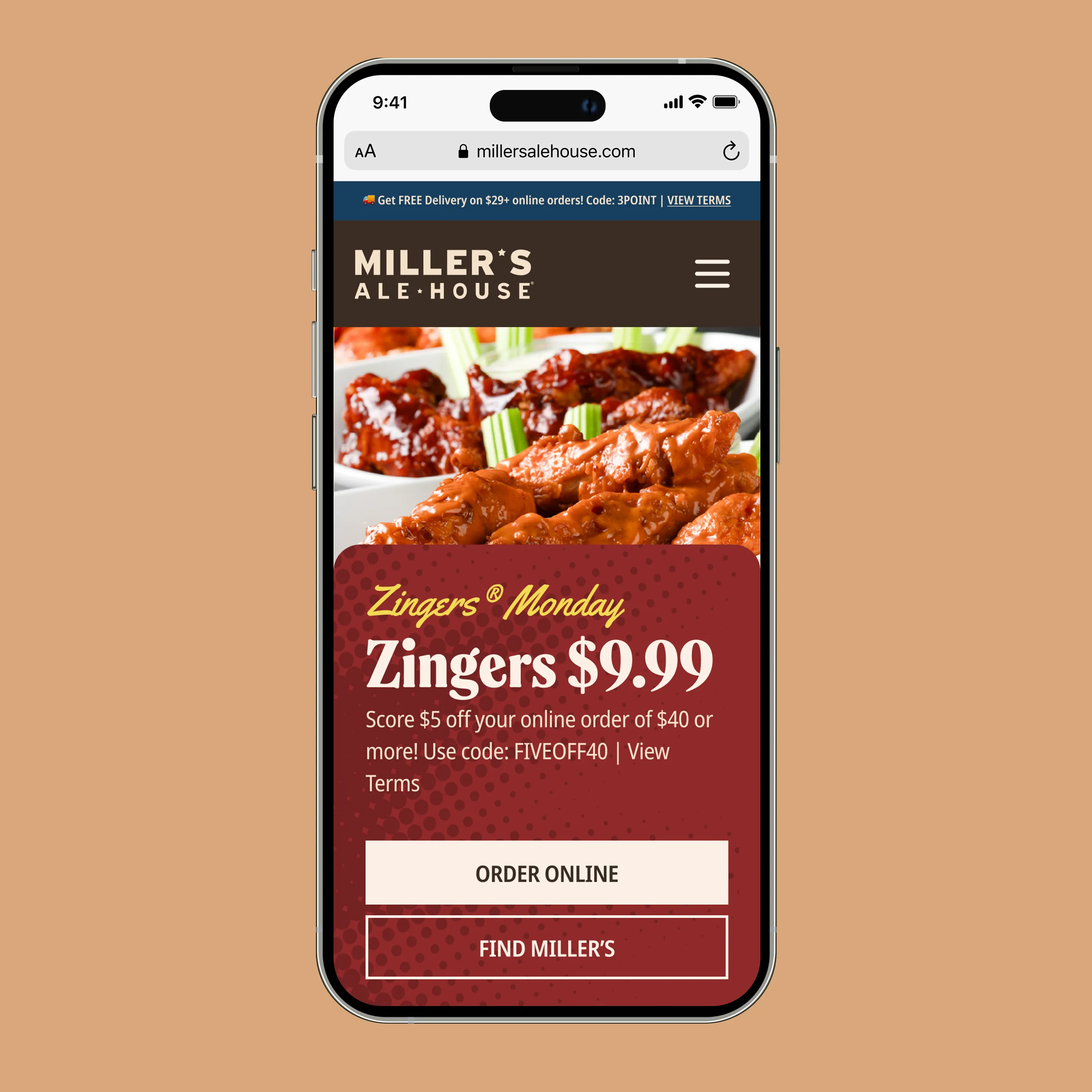
In addition to working on the menu, we also redesigned other key pages of the website — including Home, Specials, Locations, Bar, and more. Each of these pages received an updated interface with improved structure and navigation.
We unified the overall interaction logic across the entire site, enhanced content readability, and ensured that the UX remained consistent on every page. This made the user experience clear and convenient for both new visitors and returning customers.
Design: Din Relik, Eugene Lipski
Client: John Paul Mains — Founder of Click Laboratory, responsible for MAH marketing
